You have traffic. People are landing on your website every single day. Yet your sales, sign-ups, or enquiries stay flat, sometimes even shrinking, while your ad spend keeps climbing. If that sounds familiar, the problem usually is not visibility. It is what happens after someone arrives. A website can look polished on the surface and still be quietly pushing potential customers away through small, overlooked mistakes that add up.
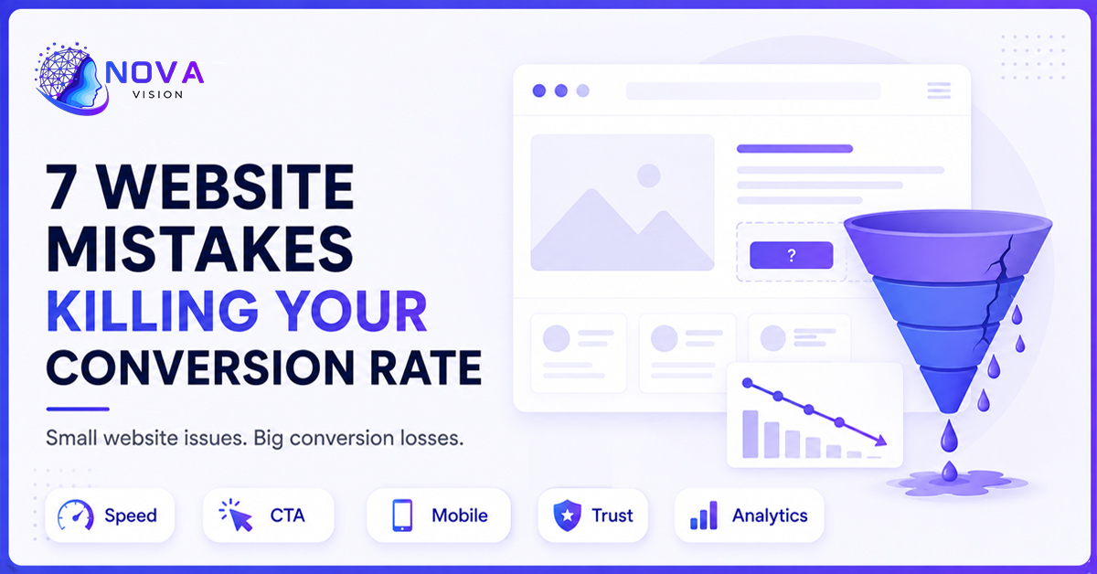
At Nova Vision, we audit websites every week that are generating decent traffic but converting only a fraction of it into real business. Almost every time, the same handful of issues show up. None of them are dramatic. None of them would make a visitor consciously say 'this site is broken.' But together, they create enough friction that people leave without taking action. Below are seven of the most common, and most damaging, website mistakes we see, along with what to do about each one.
1. Slow Page Load Speed
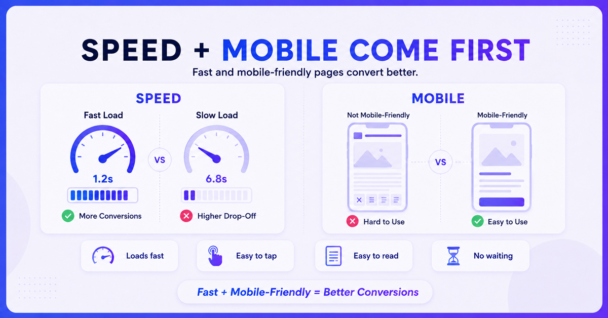
Speed is one of the fastest ways to lose a visitor before they even see your offer. Research on user behaviour consistently shows that conversion rates drop sharply for every extra second a page takes to load, especially on mobile connections. A visitor who has to wait more than three seconds for your homepage or product page to appear is already primed to leave, and most of them will, often without you ever knowing they were there.
Common culprits include unoptimised images, bloated JavaScript, too many third-party scripts, and hosting that is not built to handle your traffic. The fix does not need to be complicated: compress and lazy-load images, minify code, use a content delivery network, and remove plugins or trackers you no longer actively use. At Nova Vision, speed audits are one of the first things we run on any website before touching design or copy, because no amount of persuasive content matters if the page never finishes loading.
[Suggested Image] Alt Text: "Website loading speed test dashboard showing page performance metrics" | Title: "Improving Website Loading Speed for Better Conversions"
2. Unclear or Missing Call-to-Action
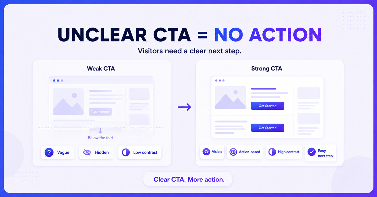
It sounds basic, but an astonishing number of websites still make visitors guess what to do next. A homepage might list services beautifully, explain the brand story in detail, and still never clearly tell the visitor to book a call, request a quote, or start a trial. When the next step is not obvious, most people simply do not take one.
A strong call-to-action needs to be visible without scrolling, worded around a specific action rather than a vague phrase, and repeated at logical points throughout the page rather than buried once at the bottom. Contrast matters too: a button that blends into the background design will get ignored even if it is technically present. When Nova Vision redesigns a client's key pages, one of the simplest and most effective changes is often just clarifying and repositioning the CTA, sometimes with no other changes to the page at all.
[Suggested Image] Alt Text: "Clear call-to-action button example on a website landing page" | Title: "Effective Call-to-Action Design That Improves Conversions"
3. Confusing Navigation and Site Structure
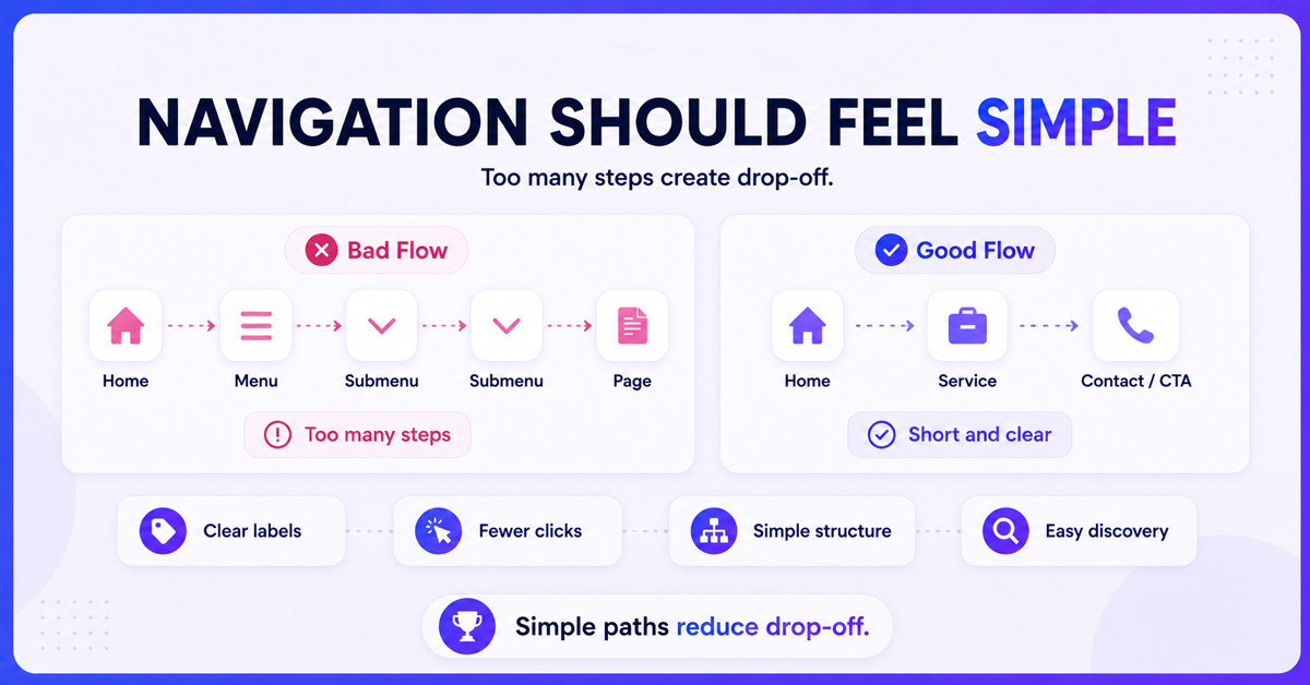
If visitors cannot quickly find what they came for, they leave and look for a competitor who makes it easier. Overloaded menus, unclear category names, and pages buried three or four clicks deep are some of the most common structural issues we encounter. Mobile navigation is often worse, with menus that are hard to tap accurately or that hide important pages behind unnecessary steps.
Good navigation should reflect how visitors actually think about your offering, not how your internal team organises it. Grouping services or products by the problems they solve, rather than internal department names, usually performs better. Running a simple five-second test, where a new user is shown the homepage and asked what the business does and how to contact it, will reveal navigation problems faster than any internal review.
[Suggested Image] Alt Text: "Website navigation menu structure diagram for user experience" | Title: "Simplifying Website Navigation for Better User Flow"
4. Weak or Generic Value Proposition
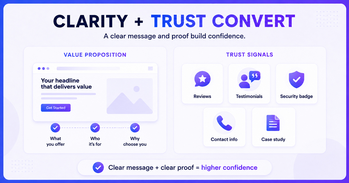
Visitors decide within seconds whether a page is relevant to them. If your homepage headline could belong to almost any competitor in your industry, you have already lost a meaningful share of visitors who never scroll further. Phrases like 'quality service you can trust' or 'your one-stop solution' say nothing specific and do nothing to differentiate you.
A strong value proposition answers three questions immediately: what you offer, who it is for, and why it is better than the alternative. This does not require clever wordplay, just clarity and specificity. Naming the actual outcome a customer gets, backed by a concrete detail or number where possible, consistently outperforms vague brand language. This is often one of the first things Nova Vision rewrites during a conversion audit, because it affects every visitor who lands on the page, not just a segment of them.
[Suggested Image] Alt Text: "Website homepage headline example showing a strong value proposition" | Title: "Writing a Clear Value Proposition That Converts Visitors"
5. Poor Mobile Experience
More than half of web traffic for most industries now comes from mobile devices, yet many websites are still designed desktop-first and adapted for mobile as an afterthought. Text that is too small to read comfortably, buttons placed too close together, forms that are painful to fill out on a small screen, and images that break the layout are all extremely common, and extremely costly.
A mobile experience should be tested on actual devices, not just a browser's resize tool, since real touch targets, keyboard behaviour, and load times behave differently than a simulated view. Forms in particular deserve attention: reducing the number of required fields and using mobile-friendly input types can noticeably improve completion rates. Nova Vision treats mobile as the primary design environment for most client projects now, rather than a secondary consideration, simply because that is where the majority of first impressions happen.
[Suggested Image] Alt Text: "Responsive mobile website design comparison on smartphone screen" | Title: "Optimizing Mobile Website Experience for Higher Conversions"
6. Lack of Trust Signals
Even when everything else on a page works, visitors who are unsure whether they can trust your business will hesitate to hand over their email, phone number, or payment details. Missing or outdated testimonials, no visible reviews, no clear contact information, and stock photography that feels generic all quietly undermine credibility, especially for newer visitors who have never heard of your brand before.
Trust signals do not need to be elaborate. Genuine client testimonials with names or company details, visible security badges near payment forms, clear contact information rather than a hidden contact page, and recognisable client logos where relevant all help close the gap between interest and action. Case studies with measurable results tend to work particularly well for service-based businesses, since they show outcomes rather than simply claiming quality. Nova Vision builds trust-signal placement into page layouts from the start rather than adding it as decoration later, because where these elements sit on the page matters almost as much as whether they exist at all.
[Suggested Image] Alt Text: "Website trust signals including testimonials and client reviews section" | Title: "Building Trust Signals to Increase Website Conversions"
7. Ignoring Website Analytics and User Behaviour
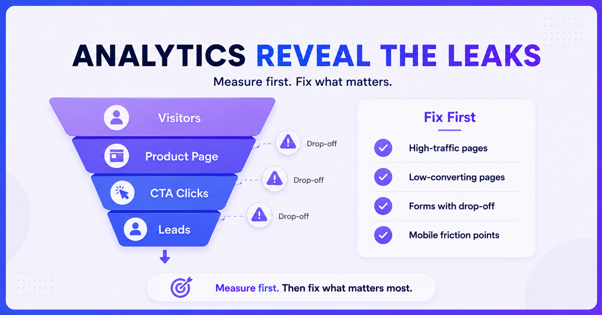
Perhaps the most silent mistake of all is not tracking what is actually happening on your site. Many businesses install analytics once during launch and never revisit them, missing the drop-off points, dead clicks, and abandoned forms that are quietly costing conversions every day. Without this data, every change to the website becomes a guess rather than a decision.
Heatmaps, session recordings, and funnel reports reveal exactly where visitors lose interest or get confused, which is far more useful than assumptions based on internal opinions about the design. Reviewing this data on a regular schedule, rather than only when something feels wrong, allows small issues to be caught before they compound into a larger drop in conversion rate. This is a core part of how Nova Vision approaches ongoing website optimisation for clients: treating the website as a living asset that needs regular review, not a project that ends at launch.
[Suggested Image] Alt Text: "Website analytics dashboard showing user behavior and conversion funnel data" | Title: "Using Website Analytics to Identify and Fix Conversion Leaks"
Bringing It All Together
None of these seven mistakes are unusual, and that is exactly why they are so easy to miss. A slow page, an unclear CTA, confusing navigation, a generic headline, a clunky mobile form, missing trust signals, and unreviewed analytics rarely feel like emergencies individually. Together, they quietly erode conversion rate month after month, often while traffic numbers look perfectly healthy on the surface.
The good news is that fixing them does not usually require a full website rebuild. Most of the improvements described here can be implemented in stages, starting with whichever issue is most clearly affecting your top pages. What matters is approaching it systematically: measure first, prioritise the highest-impact fixes, and test changes rather than guessing.
This is the exact process Nova Vision uses when auditing client websites, combining technical performance checks, user experience review, and behavioural data to identify precisely where visitors are dropping off and why. If your website is getting traffic but not turning enough of it into leads or sales, working through this list is a solid starting point, and if you would rather have a second set of eyes look at it, that is exactly the kind of audit Nova Vision specialises in.
Frequently Asked Questions
What is a good conversion rate for a website?
Average conversion rates vary widely by industry, but most websites convert somewhere between one and four percent of visitors into leads or customers. Rather than chasing an industry benchmark, it is usually more useful to track your own site's rate over time and focus on steady improvement after fixing the issues outlined above.
How quickly can fixing these mistakes improve conversions?
Some fixes, like clarifying a call-to-action or compressing images for faster load times, can show measurable results within a few weeks. Others, such as restructuring navigation or rebuilding trust signals across the site, take longer to implement but tend to have a more lasting impact on overall performance.
Do I need a full website redesign to fix these issues?
Rarely. Most of the problems covered here can be addressed through targeted changes rather than a ground-up rebuild. Nova Vision typically starts with an audit to identify which specific issues are costing the most conversions, so effort goes toward the changes that will actually move the numbers.
Key Takeaways
• Page speed directly affects how many visitors stay long enough to convert.
• Every important page needs one clear, visible call-to-action.
• Navigation should match how customers think, not internal business structure.
• Your value proposition needs to be specific, not generic.
• Mobile experience should be designed first, not adapted last.
• Trust signals like reviews and testimonials reduce buyer hesitation.
• Regular analytics review turns website updates into informed decisions instead of guesswork.