Email marketing remains one of the most effective digital marketing channels for building customer relationships, nurturing leads, and increasing conversions. However, the success of an email campaign depends on more than compelling copy and attractive visuals. Today's consumers check emails on smartphones more than ever, making mobile-friendly email design an essential part of any successful marketing strategy.
If your emails are difficult to read, slow to load, or require constant zooming and scrolling, subscribers are likely to leave without taking action. A responsive, mobile-optimized email creates a seamless experience, encouraging readers to engage with your content and click through to your website.
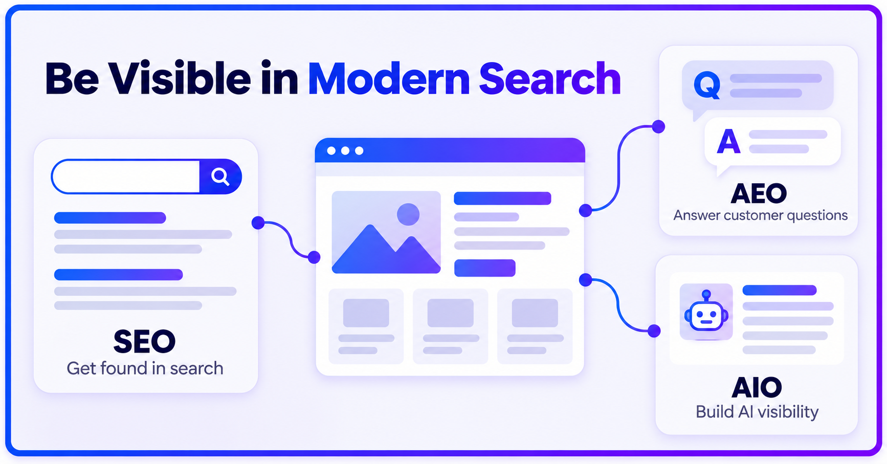
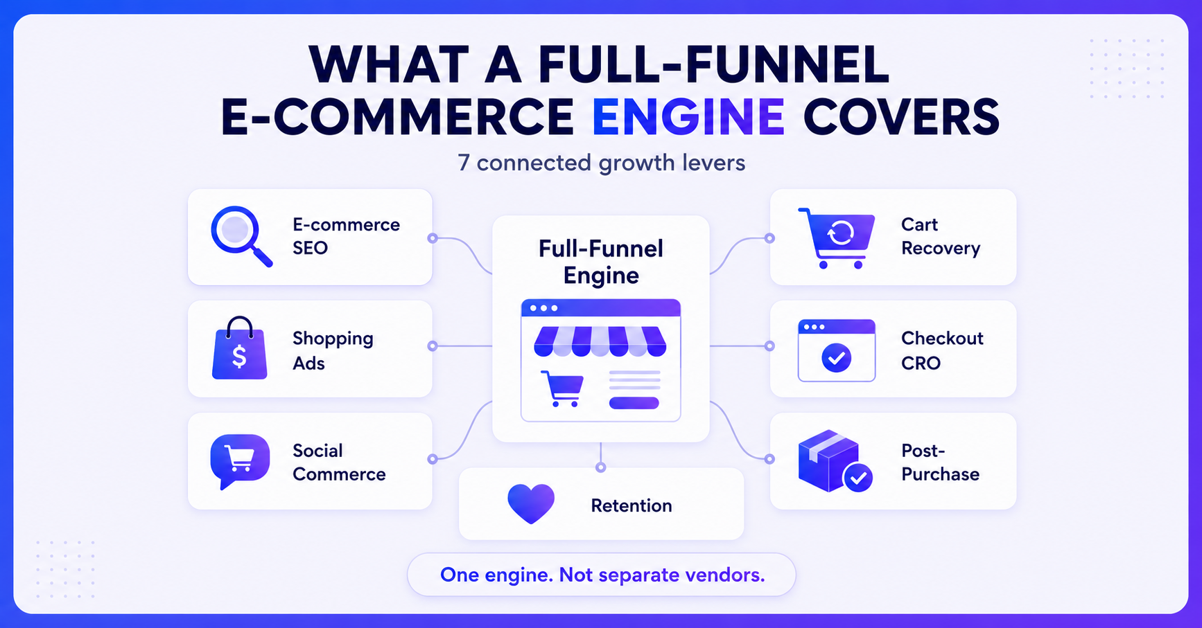
At Nova Vision, mobile-first email marketing is integrated into broader digital strategies that include SEO, paid advertising, automation, and conversion optimization, helping businesses deliver better customer experiences and measurable growth.
Why Mobile Email Optimization Matters
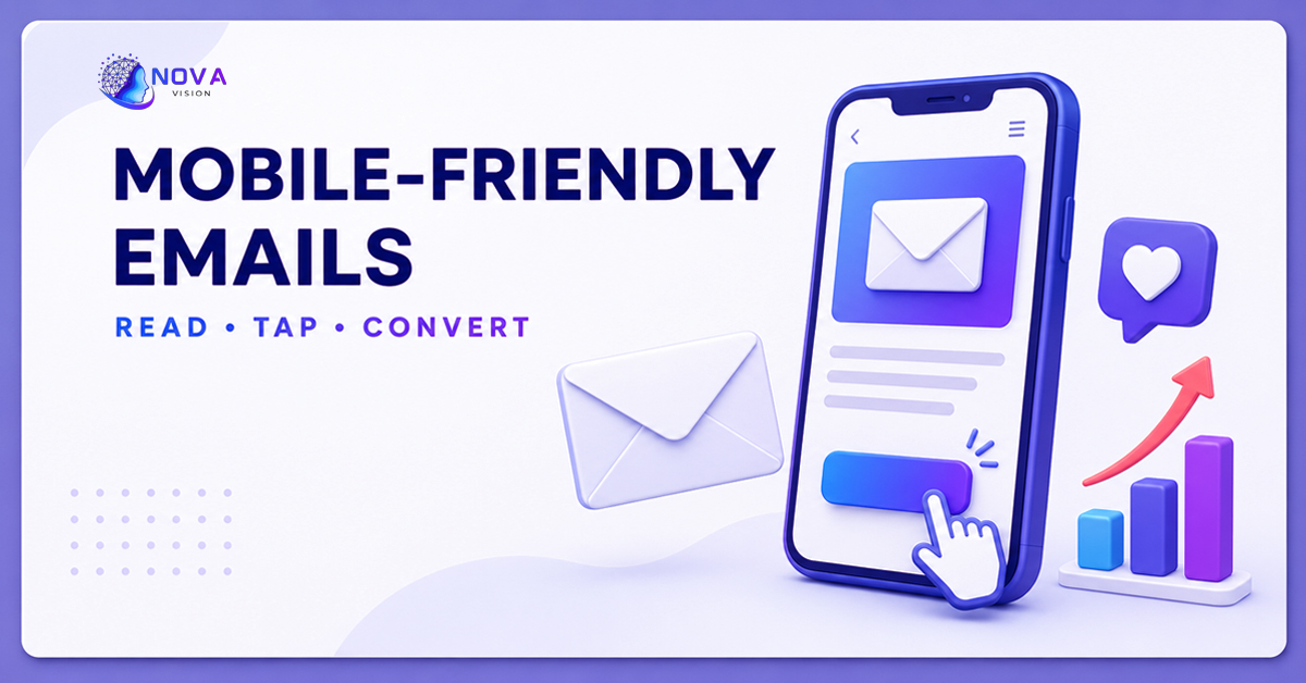
Mobile devices have become the primary way people access their inboxes. Whether checking promotional offers during a commute or reading newsletters at home, users expect emails to display perfectly on every screen size.
A poorly designed email can lead to:
-
Low click-through rates
-
Higher unsubscribe rates
-
Reduced customer trust
-
Missed sales opportunities
-
Poor user experience
Conversely, mobile-friendly emails improve readability, increase engagement, and encourage users to complete desired actions.
What Is Mobile-Friendly Email Design?
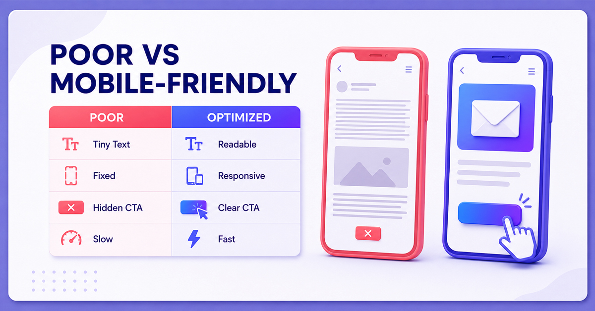
Mobile-friendly email design ensures that every element of an email adapts to different screen sizes without compromising usability.
A responsive email typically includes:
-
Flexible layouts
-
Readable font sizes
-
Optimized images
-
Touch-friendly buttons
-
Fast-loading content
-
Minimal horizontal scrolling
The goal is to make reading and interacting with emails effortless on smartphones and tablets.
Benefits of Mobile-Friendly Email Design
Higher Open-to-Click Rates
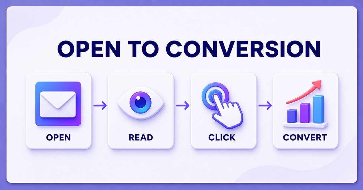
Even when subscribers open your email, poor formatting can discourage them from reading further. Responsive designs make content easier to consume, increasing the likelihood of clicks and conversions.
Better User Experience
A clean, mobile-optimized layout allows readers to navigate your email naturally without zooming or struggling with tiny text.
This creates a positive impression of your brand.
Increased Conversions
Whether your goal is generating leads, promoting products, or encouraging registrations, a smooth mobile experience removes friction from the customer journey.
Clear call-to-action buttons and simple layouts help users act quickly.
Stronger Brand Credibility
Professionally designed emails reflect attention to detail and reinforce trust in your business.
Consistent branding across desktop and mobile devices improves customer confidence.
Essential Elements of Mobile-Friendly Email Design
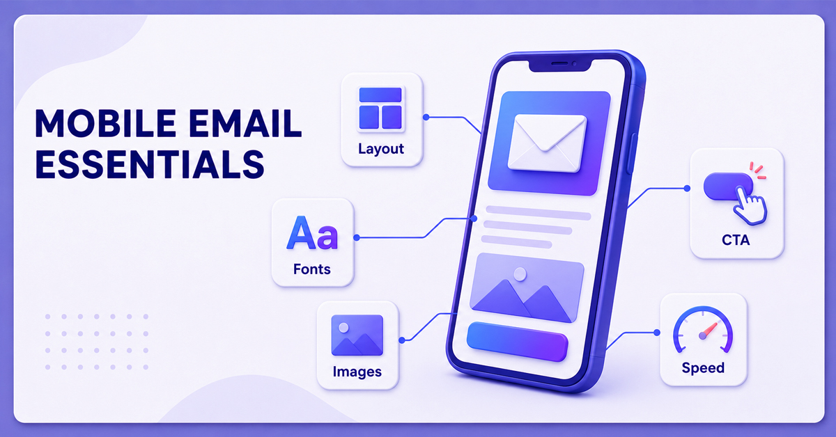
Use Responsive Layouts
Responsive templates automatically adjust based on the device being used.
This ensures:
-
Proper image scaling
-
Easy-to-read text
-
Optimized spacing
-
Improved navigation
Write Short, Scannable Content
Mobile users typically skim emails.
Keep paragraphs concise and use:
-
Clear headings
-
Short sentences
-
White space
-
Bullet points where appropriate
This improves readability without overwhelming readers.
Optimize Images
Large images can slow loading times.
Best practices include:
-
Compressing image sizes
-
Using descriptive alt text
-
Avoiding image-heavy emails
-
Maintaining proper dimensions
Fast-loading emails reduce abandonment.
Make CTA Buttons Easy to Tap
Call-to-action buttons should be:
-
Large enough for thumbs
-
Clearly visible
-
Surrounded by adequate spacing
-
Written with action-oriented text
Examples include:
-
Get Started
-
Download Now
-
Book a Consultation
-
Learn More
Choose Readable Fonts
Avoid decorative fonts that become difficult to read on smaller screens.
Generally:
-
Body text should be around 16px.
-
Headlines should be larger.
-
Maintain strong color contrast for accessibility.
Common Mobile Email Design Mistakes
Many businesses unknowingly reduce engagement by making avoidable design errors.
Common mistakes include:
-
Tiny font sizes
-
Overcrowded layouts
-
Multiple competing CTAs
-
Slow-loading images
-
Excessive scrolling
-
Unresponsive templates
-
Long subject lines
Addressing these issues can significantly improve campaign performance.
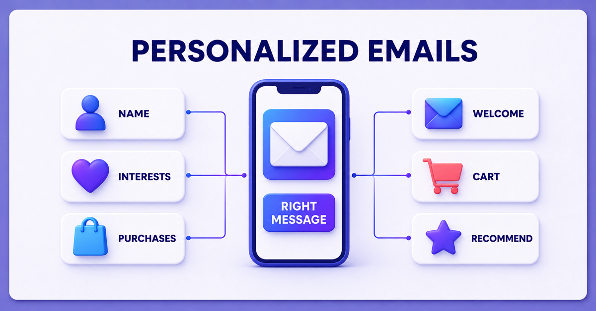
The Role of Personalization
Responsive design works best when combined with personalized content.
Consider personalizing emails using:
-
Customer names
-
Purchase history
-
Browsing behavior
-
Geographic location
-
Customer interests
Relevant and easy-to-read emails are more likely to generate meaningful engagement.
Mobile-Friendly Email Design and Automation
Automation becomes even more effective when every email is optimized for mobile users.
Examples include:
-
Welcome email series
-
Lead nurturing campaigns
-
Abandoned cart reminders
-
Appointment confirmations
-
Product recommendations
-
Re-engagement campaigns
These automated emails reach customers at the right moment while providing a consistent experience across devices.
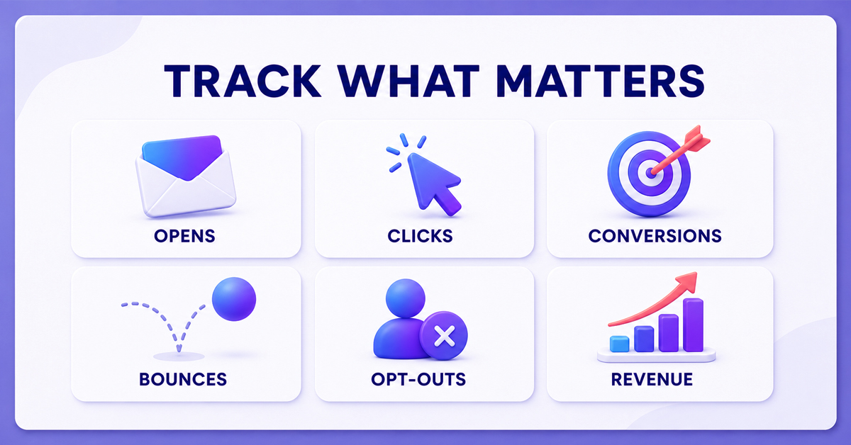
Measuring Mobile Email Performance
To continuously improve results, monitor important email metrics such as:
-
Open Rate
-
Click-Through Rate (CTR)
-
Conversion Rate
-
Bounce Rate
-
Mobile Click Rate
-
Unsubscribe Rate
-
Revenue per Email
Regular testing helps identify opportunities to improve design and engagement.
Best Practices for Higher Engagement
To maximize the effectiveness of your campaigns:
-
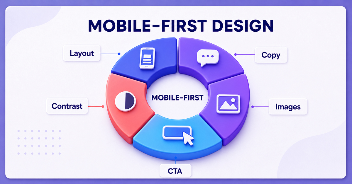
Design emails using a mobile-first approach.
-
Keep subject lines concise and compelling.
-
Use a single, clear call-to-action whenever possible.
-
Test emails across different devices and email clients.
-
Optimize loading speed.
-
Personalize messaging based on user behavior.
-
Maintain consistent branding.
-
Continuously A/B test layouts, buttons, and content.
These practices help create emails that are both visually appealing and conversion-focused.
How Nova Vision Helps Businesses Improve Email Marketing
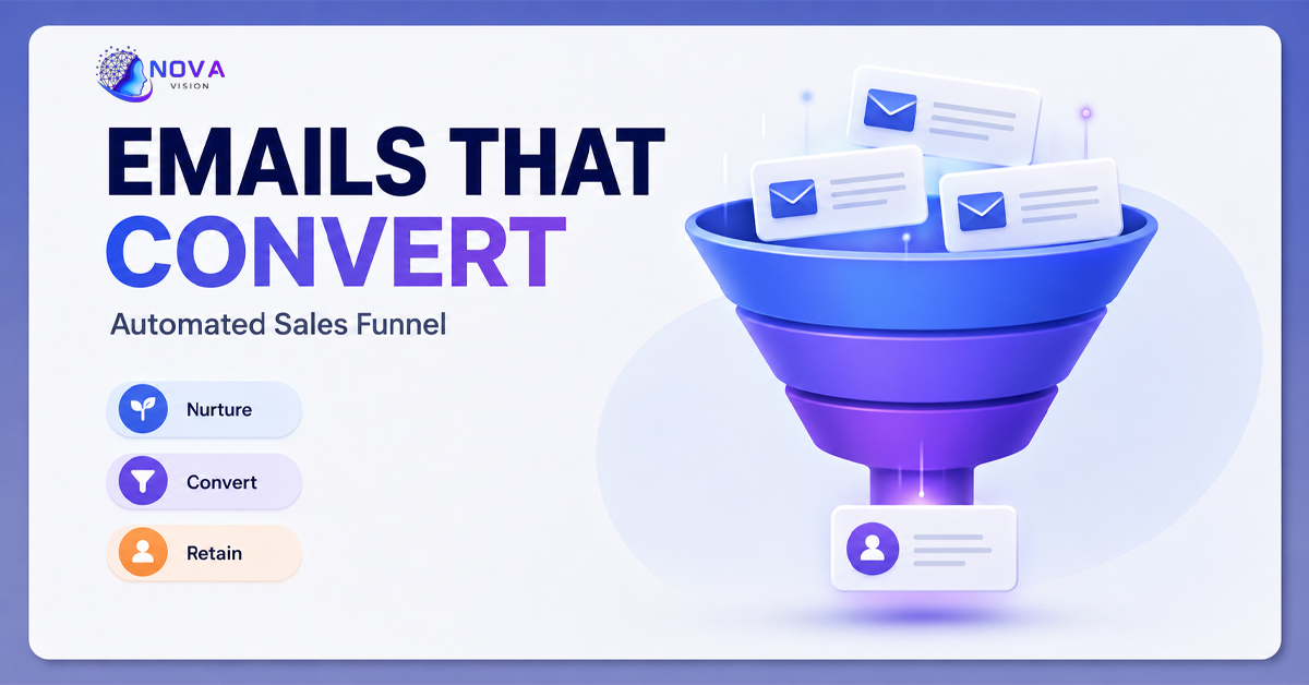
Creating successful email campaigns requires more than attractive templates. Businesses need responsive design, strategic automation, audience segmentation, persuasive copy, and ongoing optimization.
Nova Vision helps brands build high-performing email marketing systems that nurture leads, recover abandoned carts, re-engage customers, and improve overall marketing performance. Their full-funnel approach integrates email marketing with SEO, Google Ads, social media, web design, and performance analytics to create seamless customer journeys that drive measurable business growth.
Conclusion
As mobile devices continue to dominate email consumption, businesses can no longer afford to overlook responsive email design. A mobile-friendly email not only improves readability but also enhances customer experience, increases click-through rates, and boosts conversions.
By combining responsive layouts, compelling content, personalization, and automation, businesses can build stronger relationships with their audience while achieving better marketing results.
If you're looking to improve email engagement and create high-converting automated campaigns, Nova Vision offers tailored email marketing solutions that help businesses deliver the right message to the right audience on every device.